Brief by Central Staff
Colorado Central – August 2003 – Colorado Central Magazine
You might note that Colorado Central looks a mite different this month. We thought it was time for a change. But if history is any indication, there might be some unexpected and unwanted alterations, too.
Because we don’t use the same equipment, programs, or standard page sizes as our printer, Arkansas Valley Publishing, ordinarily produces, it took a while for Central pages to be straight, properly colored, and correctly stapled when we started publishing a decade ago.
Our recent changes should go easier, however, since our publication will have more in common — rather than less — with the many newspapers Arkansas Valley prints. But you never know.
Please let us know if you find anything wrong with your copy — print-wise that is (although we certainly welcome comments about content, too).
We hope you’ll find this a refreshing, agreeable change — rather than merely an annoying one. But feel free to let us know, either way.
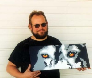
And while we’re talking about changes, you might note that KVRH has a brand new logo this month, too. Their logo was designed by Reynor O’Reilly of Buena Vista, winner of the KVRH logo competition.
Su


